Monday, April 28, 2025

Colors In Common

This may help somewhat if you are attempting to figure out which colors look best on you. The lists of colors won’t narrow down your seasonal sub type-but MAY assist in finding your main color group. It should make it easier to narrow down from there:


Winter: 


Pure white

True red

Primary yellow

Primary blue

Fuchsia

Royal purple


Summer:


Rose pink

Cool jade green

Rose brown

Silver gray

Soft burgundy

Denim blue


Autumn: 


Mustard yellow

Olive

Rust

Copper brown

Antique white

Warm plum


Spring: 


Daffodil yellow

Warm, bright green

Clear peach

Light gold

Melon 

Red orange

Monday, April 21, 2025

TCI-Bright Winter Classic

 True Colour International is the OG of color analysis products since the ending of Sci/ART (a whole other blog post). The colors are beautiful, the attention to accuracy is apparent, and the quality has remained unchanged over the years. The fans I own from 10+ years ago are still as sturdy as the new ones. 

Since these travel from Australia, the shipping times are longer, but the wait is worth it! 

You may choose between the Classic palette or the Corporate which contains more neutral colors. The last strip is a nice addition for color combo ideas. In the back are QR codes to download the True Colour Match app for purchase. 

Classic:


Corporate: 


Bright Winter-NDU Colors/Mini


There is SO much to love about these fans! The compact size retains a comprehensive feel and fits easily into just about any purse. Three strips in the back giving overall examples of True Winter, Bright Winter and Bright Spring help with any tie-breaker items you may encounter. Plus, if you live in the US, your order will be delivered quickly. To learn more, visit NDU Colors  and listen to Chrysalis Colour Analysis podcast, Ep. #46 that will tell you the interesting story of how these were created: 


Sunday, April 13, 2025

Comparing In Real Life

I wore this red blouse along with a black skirt to a special occasion very recently. People complimented ME on this color. Considering I had been ill a few weeks before with whatever flu was going on, it was nice to feel and look somewhat alive. Whatever this red was-I was on the right track. So-let’s play a game of: Guess The Season! 

(Color fans from NDU Colors )


Take a peek at how the fans look when placed on top of the garment. 

At first glance, Light Summer doesn’t look that bad. It could work ok. There’s nothing completely out of harmony, but it’s clear Light Summer can’t hold up its end of the bargain. The neutral colors on the Right don’t appear to fit. The lightest colors at the end of each strip look very washed out and tired. Even the reds and the pinks have lost energy. The more we look, the greater the disparity. The Light Summer fan hovers over the red rather than integrating with it. 

In contrast, the Bright Winter fan colors can hold their own. The red blouse easily becomes part of the palette. Any of the neutral colors will look great with this red. Could the lightest colors appear a bit lost? Possibly. But, these light colors are far better than anything Light Summer brings to the table. Notice in particular the cover color. Light Summer’s minty green is too faded. Bright Winter’s turquoise looks like it belongs there. 

Does the red of this blouse perfectly match anything on the Bright Winter fan? Not really-but it fits nicely in between. Could there be a better blending and match with the True Winter fan? 


In reality, True Winter doesn’t pack enough punch. Is it better than Light Summer? Without question. But, the red garment is more full of pigment. True Winter pinks appear too frozen. The purple tones are dull and the darkest colors are very heavy. If I were in the True Winter color category, I could get away with this blouse in a pinch, but holding out for something better would be a wise, money saving choice. 

Especially if you are new to color analysis, you may not have seen obvious differences, and that’s ok. It does take some time to use the palette as a tool. Once your eyes are used to doing comparisons, it does get easier, with a little patience and practice. 

If you are on the fence about something and are having a hard time making a decision, give your eyes a break and walk away from the item for a while. It could be when you arrive back, the answer will be more obvious. Also, your smart phone flash light should help you make a decision. 

I hope this helps you use your palette easier! 


Sincerely, 


Saturday, February 22, 2025

Ten Things to Know About Dark Winter


Soft Summer and Dark Winter are considered close, but the value contrast level of Dark Winter is much higher and Soft Summer is very low contrast. Also, the color saturation of Dark Winter is much higher. The advice? Neither can truly borrow from one another with any degree of success. 

Dark Winters may have felt comfortable wearing black all their life, but a very dark brown may be more of an enhancement. 

Add in some of Autumn’s texture when wearing fabrics, while sticking closely to your palette. 

Tumbled gemstones of garnet, amethyst, jade and malachite-polished to a smooth shine-can be worn successfully. 

Dark Winter does not equal jet black eye liner. Deep brown, charcoal or espresso are better choices. 

Polished pewter is a metal worth trying in jewelry, belts and handbag hardware. 

Three lipsticks to try: Burgundy, plum and cranberry red.

Don’t overlook pine green as a color to wear. 

Hammered finishes may be better than solid, polished shine. 

Marcasites are beautiful on your coloring. 


Hair Color and Eye Color

 If you have difficulty accepting being draped into a seasonal category because you don’t look like the stereotype, I understand how you feel. As a dark blonde Bright Winter, I’ve lived it. Here’s a list of what we’ve all read and heard from color analysis systems: 

Winters are brunette.

Autumns have warm hair. 

Summers are soft and blended in their coloring. 

Most Springs are blonde or have shiny red hair. 

If your hair is mousy (can we STOP with that descriptor?) you are Summer. 

Tan skin always means Autumn. 

I can add a whole lot more to this list. 

You can end up going home and doubt the results, especially if you do a search on Pinterest and start examining your seasonal category. There is a chance that, yes….you DO fit the “typical”. But-what if you don’t? What if you are a red headed Light Summer or a brunette Soft Autumn? Should you question the results? 

First, push that thought aside. It can cause unnecessary confusion. 

Here’s how to start out. 

Look at the 12blueprints or Sci/ART consultants pages and pay attention to client photos. You will discover a plethora of people who don’t fit into any stereotype that are in seasonal categories no one would imagine. Hopefully, this will help you feel more settled. 

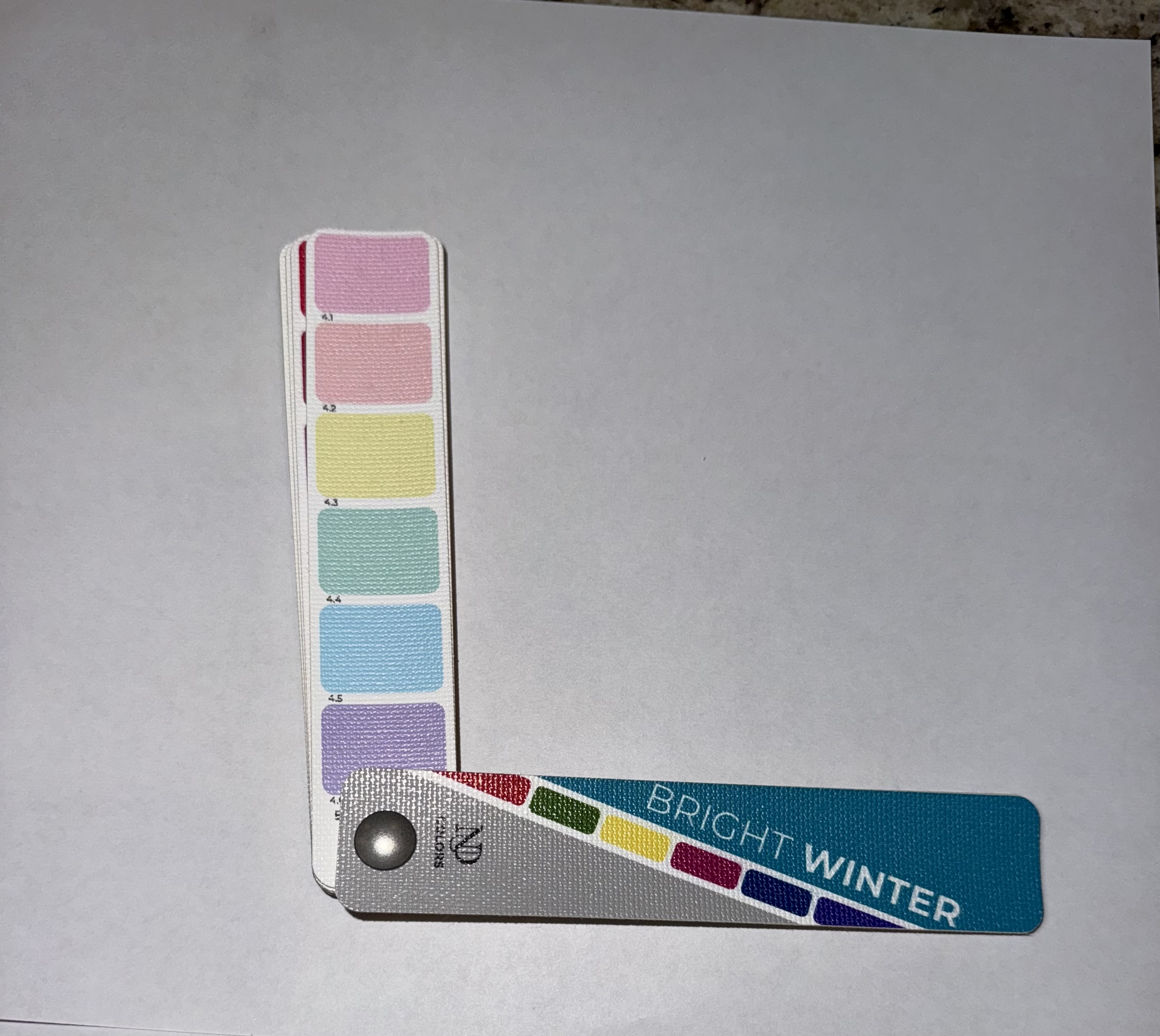
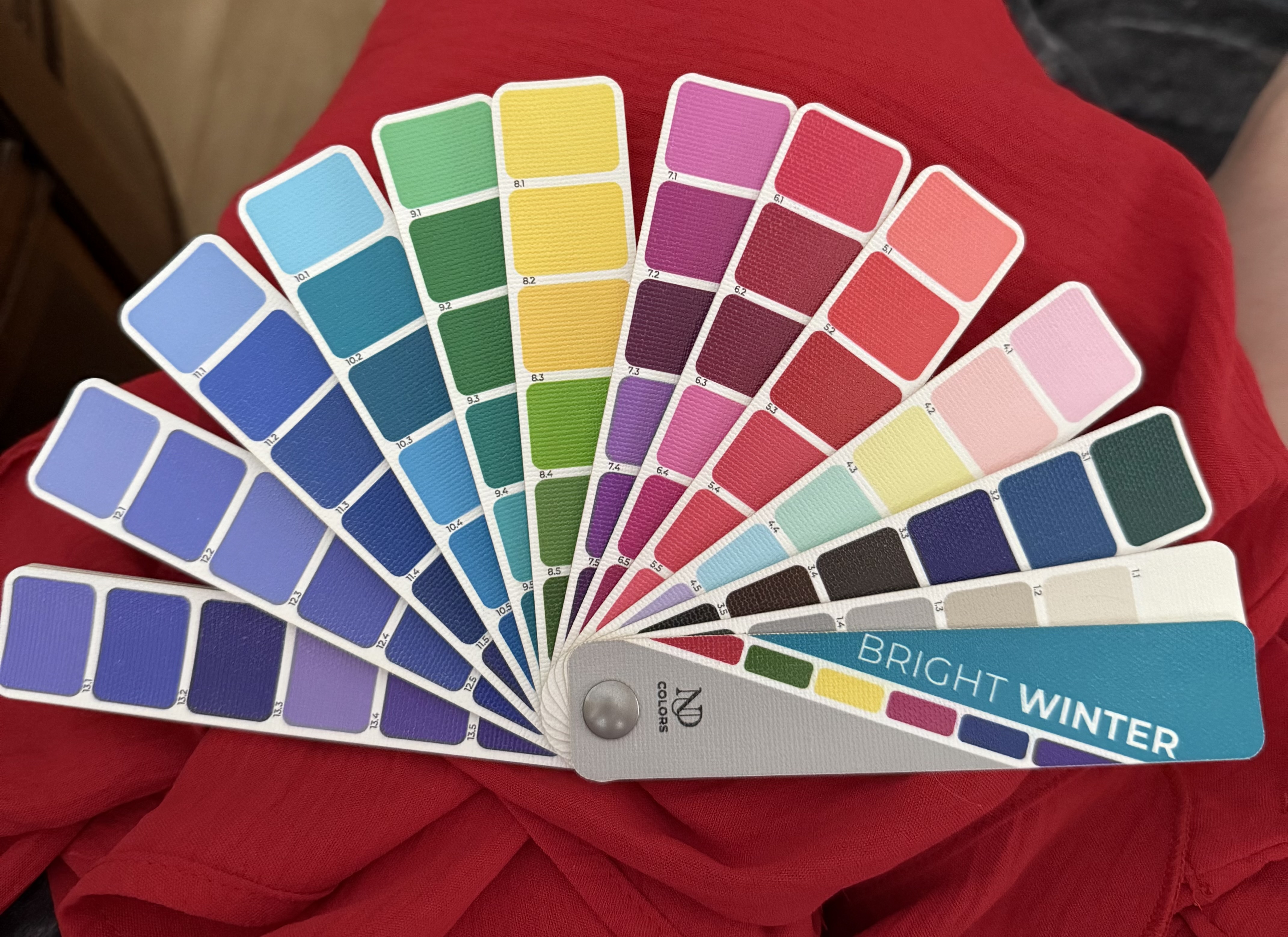
Then, take a deep breath. Look at your color palette and choose 3 shade ranges you like. (E.g., you like the purples, pinks and blues.) I recommend purchasing 3 t shirts in solid colors and two lipsticks, preferably in the mid range of your palette, because that shade range is flattering for anyone in your seasonal home. See how you feel, and wait for the compliments that have nothing to do with the garment or cosmetics themselves. You can be sure, at that point, you are on the right track. 

With a correctly done draping session, especially during the final steps, you will see how your hair, skin tone and eyes work together. One feature should never be isolated. A color palette that looks great with your hair or your eyes might not do your skin tone any favors. If your skin looks at its luminous best, then everything else will fall into place as a whole picture. This is one reason why hair is covered. It minimizes distractions and places focus on the most important thing-skin reaction. 

One really interesting fact I learned from Christine Scaman: you can put together two people, side by side with the same outward appearance, and one person will have relatively brighter eyes and more richly colored hair than the other. One could appear lighter, the other slightly darker or warmer. These people appear the same in coloration, but are in completely different seasonal categories.

I’ll share much more I’ve learned from Christine’s book “Return to Your Natural Colors.” Until then, don’t stress and be open minded in giving your palette a try. 


Sincerely, 


Tina


Saturday, February 8, 2025

True Winter vs Bright Winter


Fans from NDU Colors


 I’ve heard it said, if you’re going to cheat on your seasonal category, the best place to go is the True season next door. If you are in a neutral category, borrowing from your neighbor neutral season might prove problematic, because it will either be too light and warm, or too dark and cool.

Can a Bright Winter borrow from True Winter and still look in harmony? I think it depends where you borrow colors from. The dark end of True Winter may prove to be a bit dull and heavy, so it may be best avoided. True Winter yellows and reds should work great, since they are the relatively “warmer” colors in the palette. The medium to lighter end, especially since Bright Winter is the lightest of the Winters, may be a nice place to explore. 

True Winter has some blues and blue greens that remind me of fresh spearmint. Medium pinks, cool fuchsia and the more intense purples are good for Bright Winters to explore. The neutral colors in both of these seasons are quite close. In a perfect world, we would stick to our seasonal category as a rule-but sometimes borrowing is a necessity. 

For Bright Winter, I don’t think the darkest True Winter colors will work unless the fabric is shiny. The coolest of blues may indeed read as too chilly. Some of the “lipstick” red violet colors in True Winter lack the vitality that Bright Winter needs and may appear heavy and dull. 

Conversely, True Winter can borrow freely from Bright Winter’s darker colors and use the neutrals. The cooler icy colors, the deeper “lipstick” tones and especially the darker purples, greens and blues are nice areas to consider. 

I’m not loving the brighter reds, coral pinks or the acid lemon yellows and lime colors in Bright Winter for a True Winter to use with success. The warmer icy tones won’t be good choices. Still, it’s very interesting to compare the similarities and not so much the differences between the two seasonal categories. 

Here comes a couple of questions: 

Should True Winter borrow from True Summer? 

What about Bright Winter wearing Light Summer? 

The problem is NOT the hue. True Winter and True Summer are cool. Bright Winter and Light Summer are neutral cool.The problem is: lack of chroma or saturation. If either True or Bright Winter attempt to wear an outfit from their “sister” seasons, the garments will look faded and dull. Furthermore, the face will dominate, giving the wearer a look that seems as if the colors can’t hold up the head. 

The eye color may appear uninteresting and lackluster. The facial features could give the illusion of losing symmetry. In the case of Bright Winters wearing Light Summer, the face may expand and cause the chin and neck to melt together. True Winter wearing True Summer may have a skin tone that looks as if it’s sprinkled with concrete dust, and a complete lack of harmony and balance is the result. 

Sometimes, sticking to our best palette when shopping for garments, handbags, shoes or accessories may not be a possibility. The key is knowing where you can bend the rules and still look your best.

Sincerely, 

Tina