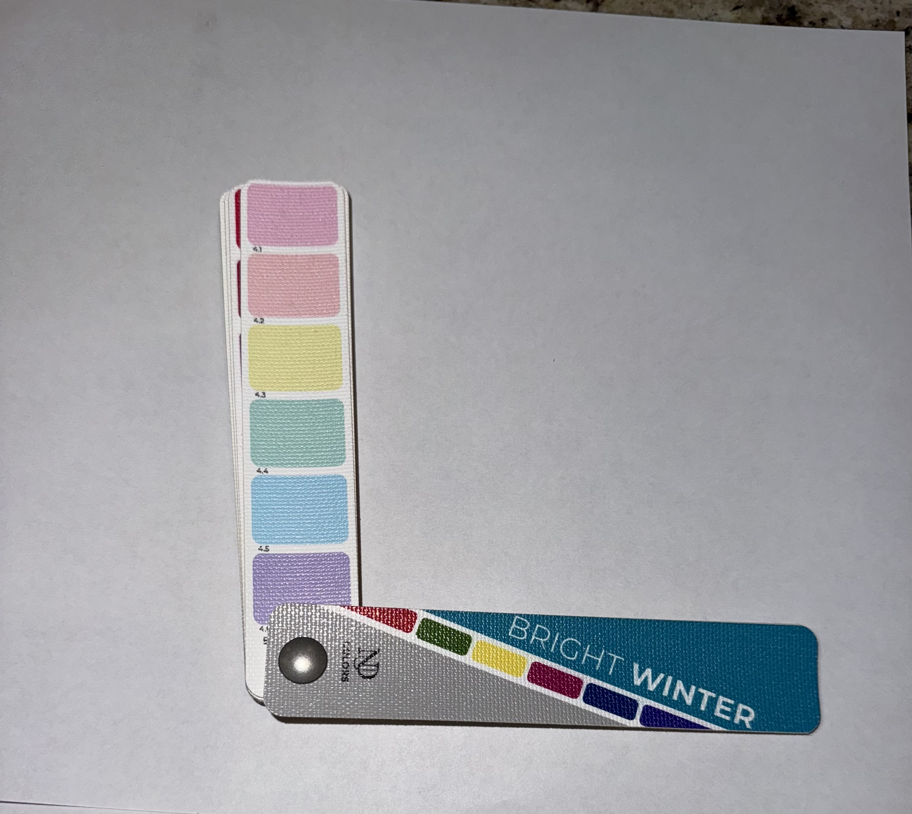
I wore this red blouse along with a black skirt to a special occasion very recently. People complimented ME on this color. Considering I had been ill a few weeks before with whatever flu was going on, it was nice to feel and look somewhat alive. Whatever this red was-I was on the right track. So-let’s play a game of: Guess The Season!
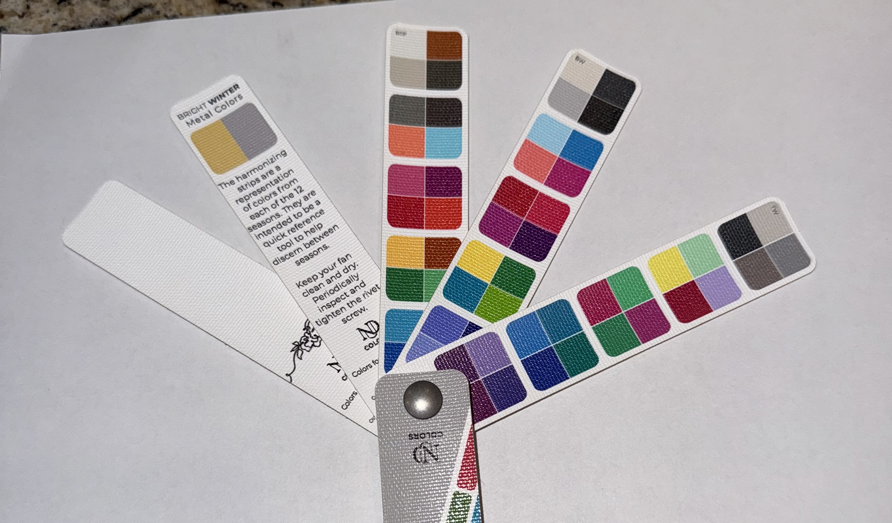
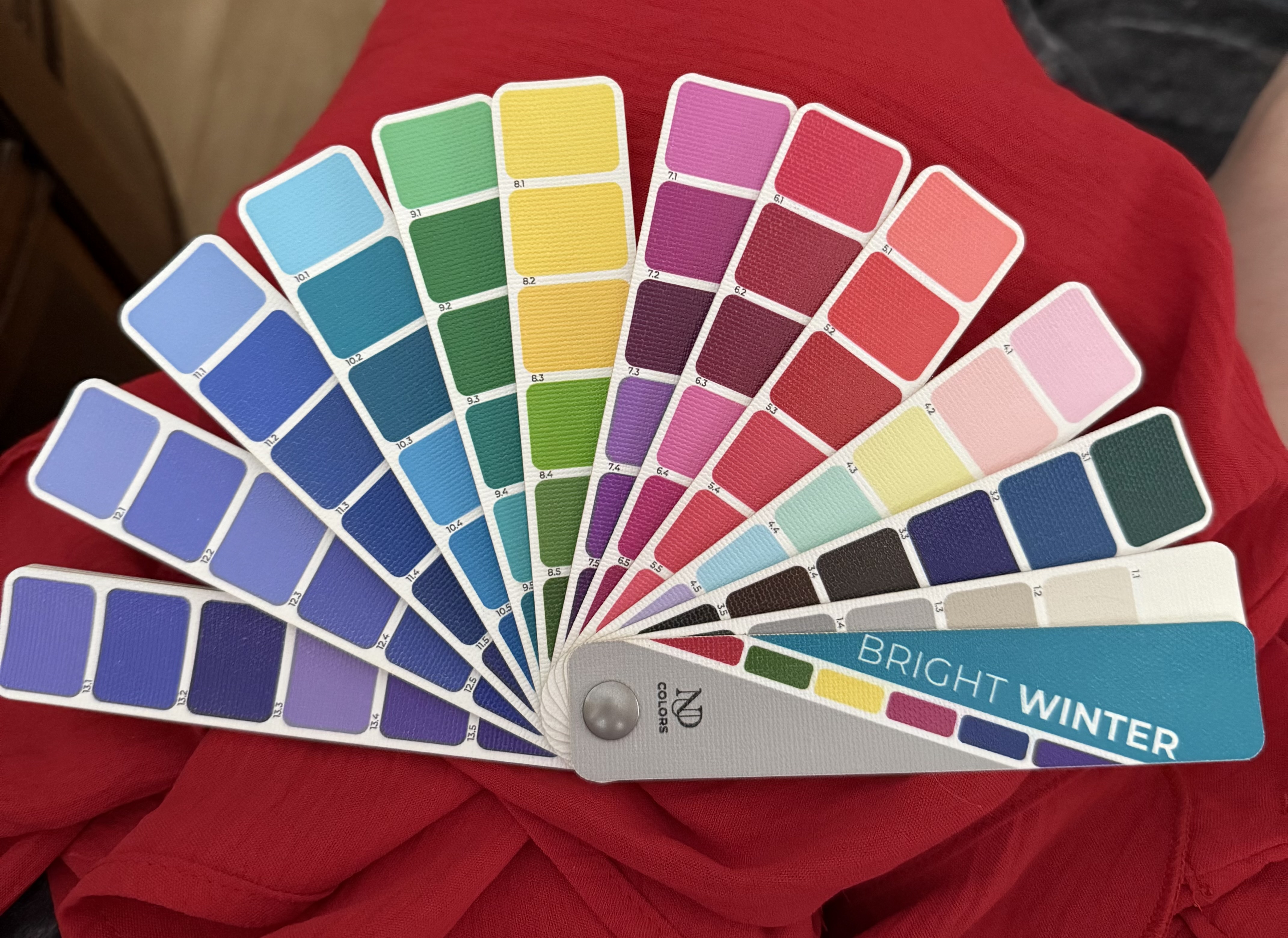
(Color fans from NDU Colors )
Take a peek at how the fans look when placed on top of the garment.
At first glance, Light Summer doesn’t look that bad. It could work ok. There’s nothing completely out of harmony, but it’s clear Light Summer can’t hold up its end of the bargain. The neutral colors on the Right don’t appear to fit. The lightest colors at the end of each strip look very washed out and tired. Even the reds and the pinks have lost energy. The more we look, the greater the disparity. The Light Summer fan hovers over the red rather than integrating with it.
In contrast, the Bright Winter fan colors can hold their own. The red blouse easily becomes part of the palette. Any of the neutral colors will look great with this red. Could the lightest colors appear a bit lost? Possibly. But, these light colors are far better than anything Light Summer brings to the table. Notice in particular the cover color. Light Summer’s minty green is too faded. Bright Winter’s turquoise looks like it belongs there.
Does the red of this blouse perfectly match anything on the Bright Winter fan? Not really-but it fits nicely in between. Could there be a better blending and match with the True Winter fan?
In reality, True Winter doesn’t pack enough punch. Is it better than Light Summer? Without question. But, the red garment is more full of pigment. True Winter pinks appear too frozen. The purple tones are dull and the darkest colors are very heavy. If I were in the True Winter color category, I could get away with this blouse in a pinch, but holding out for something better would be a wise, money saving choice.
Especially if you are new to color analysis, you may not have seen obvious differences, and that’s ok. It does take some time to use the palette as a tool. Once your eyes are used to doing comparisons, it does get easier, with a little patience and practice.
If you are on the fence about something and are having a hard time making a decision, give your eyes a break and walk away from the item for a while. It could be when you arrive back, the answer will be more obvious. Also, your smart phone flash light should help you make a decision.
I hope this helps you use your palette easier!
Sincerely,